Tuesday, 24 March 2009

Evaluation


In what ways does your media product use, develop or challenge forms and conventions of real media products?

After looking at diferent music magazines and their conventions I created my own music magazine. My magazine follows many conventions of the magazines which I have analysed for example the mast head is on the top left hand corner of the front cover. This is so that the magazine title can be seen when magazines are stacked on shop shelves. Also, the mast head is a short one word title which is memorable. I have included the price and barcode which is conventional, purely for necessity rather than appearance values. The main headline is in the centre and right justifed. The text is, large and bold with some different colour backgrounds for emphasis. This headline text being the largest on the page is conventional of every magazine. And the word 'exclusive' is often seen on magazines as an incentive for people to buy this particular magazine, as the consumer believes that they are getting something from this magazine that they will get from no other magazine. Down the left hand side of the front cover is all of the subtitles for other articles within the magazine. It is a convention of other articles from within the magazine to be titled on the front cover, and are predominantly placed down the left hand side of the page. The image also follows the conventions of magazines as it shows the main feature artist and this takes over most of the page. However, conventionally magazines also have smaller images for inside articles. The magazine 'Rolling Stone' does not follow this convention and neither did my music magazine. I think that this would work better and not distract from the main article. Instead of having lots of images, like 'Rolling Stone' I chose to use more subheadings. The contents page is quite conventional as it contains an image that is not too distracting as the purpose of the page is informative. The lay out of my double page spread follows those I analysed earlier in NME. It is conventional in having a large headline and large focus image and then smaller text for the main article with a pull quote to give a rough idea of what is in the article. The pull quote almost has the effect of a highlight, giving a preview.

How does your media product represent particular social groups?

This media product aims to represent those in the music industry within the genre of popular music, and also fans of this music. The aim of any magazine is to represent their particular social group positively. I have done this mainly within my double page spread with the topics covered within the interview. I have tried to portray the represented social group positively with the use of bright colours and topics suggested in the contents page.

Who would be the audience for your media product?
How did you attract/address your audience?

People who like this style of music and are interested in things such as new releases will also be the target audience. My magazine is predominantly targeting females who are possibly in there late teens. Unlike the majority of current pop magazines, I have chosen not to aim this magazine at younger teenagers as the market for this already appears to be quite saturated. Instead I have chosen to create this magazine which covers more mature themes yet still has quite a young, quirky appearance shown through the 'wobbly' fonts. This can be seen in the colours used on the front cover, the title 'melody' also seems quite feminine, as do the topics covered within the magazine. The colours of the magazine are predominantly reds and pinks which are stereotypically feminine colours, and also the female on the front shows how the magazine feature is going to be about a female. Having the main feature about a popular female when the target audience is females, could help attract the teenage girl audience as she may be there idol, they may be interested in her and aspire to be like her. Also they maybe able to relate to what she is saying within her interview. On the front cover of the magazine, one of the features is also quite a feminine topic with regards to pop stars personal lives rather than just there music.

What kind of media institution might distribute your media product and why?

The magazine would be distributed by a publisher which could include Bauer (formally known as EMAP), IPC or Future. I think that my magazine would be best suited to IPC as they have already have a range of magazines targeted at females, and they also have a range of music magazines, however they do not have a music magazine aimed particularly at females. Therefore they have a gap within there target markets. IPC therefore have experience in both areas of this magazine making them a suitable choice. Their current magazines are also well known and highly popular showing these to be good publishers.

What have you learnt about technologies from the process of the constructing this product?
Looking back at your preliminary task, what do you feel you have learnt in the progression from it to the full product?

In the process of constructing this product, I have learnt a lot about the use of computer software such as Photoshop, Publisher and Word. I have realised how design choices such as layout, fonts, or colouring really can affect the final product and how the smallest thing can make a big difference. I believe that carrying out the preliminary task helped with my main task as it made me more familiar with the software I was using, therefore making my final piece better than if I were to be using the software for the first time.

After completing my final products and having them evaluated I decided to make a few alterations however due to computer restrictions this was possible. My magazine was designed and made on a free trial of a programme and the trial has since expired making it impossible to make any future edits to the magazine. If I had the option of making alterations I would choose to move the main image downwards slightly on the front cover to reveal more of the mast head. However, if this were a well established magazine, covering part of the mast head would not pose a problem as it would be easily recognised even if only partially visible. I would also change some of the fonts for the smaller feature articles to make them more feminine and rounded. On the contents page, I would have added more content to the magazine so that the magazine appeared more full rather than the current contents page which only goes up to page 22. This seems like very few pages of what a magazine should have, and not worth the £2.80 shown on the front cover.

Within the preliminary task I did not have this priduct after using a different programme. However within my main task I chose not to use the same programme as I did not have easy access to it.

Monday, 9 February 2009

Double Page Spread

This image shows my final double page spread. The image takes up the majority of the of the pages, covering one whole page and then spilling over onto the next page. The image has once again been edited as it has been brightened with contrast levels also being increased. This makes the colours brighter and more bold. Overall this double page spread is very red as colours from the image have been used elsewhere on the page to create a colour theme
so that the pages do not become too busy and overpowering with colour clashes.
The main title has a bright red backround with a thick black outline for emphasis. The sofa in the image is also red so these to colours connect. The text is then a bold italic black over the red so that it stands out with the subheading on the same background overlaying the main title.
Beneath this is a brief outline of the interview written in the problem secratery font and a deep red, once again following the theme.

Final Contents Page

This image shows my final contents page which is mainly based upon the example I looked at from the hip-hop magazine. The title of the page is in the bold 'rubber stamp' font to create continuity from the front cover. All other main titles on the page are also in this font however the text is smaller with a 50% transparent red background which is set out 'wonky'.

The rest of the text on the page is written in the font 'problem secretary' which is a mixture of both basic and unusual. Whilst the font its self is a basic typewriter font, the lay out of the wobbling makes it more attractive and fun yet still comprehendable. Each page number is also in bold making it more eye catching and seperating it from all other text.

The image on this page I like because it is like she is leaning on the edge of the page. The image has been editing a lot with the forground being cut away from a background and then brightness and contrast levels have also been edited. This makes it appear more pop art with bright colours and high contrast levels. The image also allows for all text to be left justified.


Final Front Cover


This image shows my final magazine front cover. It uses all the typical conventions of a magazine cover with the magazine title in the top left corner. The main title is written in a font called 'clementine sketch' in a deep red colour. It is almost like a logo which would be widely recognised and be a symbol easily noticed and established when people think of music magazine.

Above the title is a small strip of colour in a pale red with white text showing what the magazine contains, with the word exclusive in a bold font so that it stands out amongst the rest.

The main image is a medium close-up shot of a 'pop-star'. The image has been edited to so that it is brighter with more contrast which makes the image stand out and also appear more professional. The brightening almost acts like an airbrush as it removes any blemishes or imperfections within the photo.

Over the photo is the main article headline. This is written in a font called 'rubberstamp' which is very bold therefore stands out. Different parts of the text are in different colours, on different backgrounds, or in a completely different font. The word exclusive is written in a bold black with a slightly transparent red background which is not straight but slightly 'wonky'. This makes the word exclusive stand out which will make it more appealing as it shows how people should buy this magazine as an alternative to any others as this is the only magazine to have this story. The name of the artist is also written in the rubberstamp font however this has no background and is instead written in a deep red, similer to the magazine title. This shows how it is a name, like the name of the magazine and it also follows the colour scheme of the rest of the magazine. The words 'She's Back' is written in a basic 'calibri' font as it is not the main part of the headline and it slightly overlays the name of the artist which shows how whilst they are in different fonts, the text is still connected. The main part of the headline is also in the 'rubberstamp' font in a bold black but without a background making this text stand out. All of this headline is right side justified with the 'exclusive' beginning almost centre page which is a typical convention. All other article titles and information is left justified, in a smaller basic font and also in a lighter colour. This shows how these articles are not as important as the main article.


Also on the front cover is a barcode which all magazines need as well as a price and issue number. These are placed in the bottom left corner and they are almost the smallest things on the page as they are purely about the selling of the product rather than the appearance or the contents.


Sunday, 8 February 2009

Double Page Spread Mock Up


This double page spread is based on those of magazines I have looked at previously with the main image crossing both pages. The main headline will then lay over the image with the article down the right hand side. From the article there will be a quote which had been enlarged and then embeded in the article. At the beginning of the article I intend to use a drop cap which has almost become a convention of magazine articles.
These two images are ideas for the double page spread. They show a female artist who the article will then be based upon. Rather than using one large image I could also use two smaller images however not this particular two as they are too similar in my opinion,

Contents Page Mock Up


My mock up for a contents page is based primarily on the contents page from the hip hop magazine and an example is shown below in a previous post. The artist used for my double page spread and front over will also be used for my contents page along with some smaller images which I will possibly take from the internet. I expect the page to be invisibly divided down the centre with the photograph on one side and the text on the other. The writing should be basic and clear however the contents page should also give the impression that the magazine is going to be filled with lots of appealing articles.


These images I think would be suitable for the contents page in particular the second and third image. The second image I think it would be good for her to be leaning on the edge of the page however I think that the third image is quite fun, casual and friendly therefore making it more appealing.

Magazine Plan

This image shows a mock up design for the layout of the front cover of my music magazine. It shows how the masthead should be placed in the top left hand side of the page which is conventional of a magazine. I would also like all other texts to be down the left hand side which would show other articles which are featured within the magazine. There should also be a small eadline along the top of the magazine just above the masthead. The image should be the main focus and cover the majority of the page. At the right hand side of the mast head there could also be a smaller image related to another article. The main headline should be almost central and overlay the main image. It should be eyecatching, bright and bold. And finally in the bottom corner should be a bar code which all magazines must have. Alongside the bar code will be the price, date and issue number.


This image on the left shows some ideas for fonts for the mast head. I chose the name melody because it is a music magazine and melody is related to music overall, and not just one particular genre. This is suitable for this magazine as it does not relate to one particular genre, it relates to popular music. Out of these five particular typefaces, I like the first image as the letters sway and are uneven which reminds me of musical notes on a stave. However I also like the bold style of the second typeface although I think this could be more suited to the headline.


These four images are possibilities for the front cover. I took a wide range of photographs for this magazine and these I believe are four which could possibly used for the front cover, my favourites being the first and second image. The second image would allow for space so that more text can be placed on the cover without the main focus being interrupted. I chose a plain background to keep the cover simple and also so the text would show up more clearly. Also the background would't distract from the main focus of the image. I would edit the colouring on each photo making them brighter so that they stood out more and hopefully looked a little more professional.

Friday, 16 January 2009

Music Magazine - Double page spread.

This image is taken of a double page spread from the music magazine Rolling Stone. There is a very large image which takes over one full page and then continues to spill over onto the other page. I chose this double page spread as an example not because of the main image but because of the mast head. I like how the mast head and the text beneath is slanted and almost leaning off the page. Also the lettering of the mast head is bold and stands out. The lay out of this mast head will possibly influence the mast head of my double page spread.


I like the image on this double page spread as the person who is the main focus points towards the reader, and the shadow of the main focus points towards the article which draws the reader towards the article. Also all text is overlayed on the image in a question and answer style article, with all questions being asked in a bold red, and all other text in the conventional black font. There is also use of a drop cap in the opening paragraph which is conventional of most articles.


I like this double page spread mainly because of the image which is a close-up. The artist is heavily made up and very stylised. The image spills over from one page to the other where the article then is. The head line is layed over the main image. The text of the headline is white which contrasts with the dark background. There is also a large pull quote with the centre of the article which emphasises part of the article and highlights what is thought to be an interesting line.

Music Magazines - Contents Pages


This image shows a contents page from the Rolling Stone magazine. It contains a large image, with details of what is within the magazine down the right hand side. The background of the image is cut from the top leaving only the foreground. This reveals the hand of Kanye West covering part of the title and standing out from the background and original image. There is also a brief story about Kanye West overlayed on the image with a small headline. The font is all very formal and the content of the writing is also very detailed.


This image shows a contents page from a Hip-hop magazine, it has a clean white background with the main image just a foreground with no back drop. The image is of a widely recognised artist of the magazines targeted audience. The actual contents are the right hand justified which I like as this is unconventional. The colours on this page are simple and bold with only three colours being used; white, black and red.

Saturday, 3 January 2009

Music Magazine Covers

Previous/Current Magazines


Smash Hits was a magazine aimed at young teenagers and was about mainstream music, what was currently in the charts and who was in the spotlight. It was a weekly and was published for 28 years until its popularity began to decline and by 2006 it had been removed from shop shelves and was no longer published. The cover of the magazine was always bright and vibrant with large fonts and bold colours. This makes it eye catching when it is amongst other magazines on shop shelves. More than one headline was always featured on the front with the main focus on a chart topping artist or group. It also offered gossip as this cover shows 'stars exposed' and involves the reader with use of the second person. The words 'you'll love' are directed straight at the audience and involve them with the article making it more appealing. The magazine cover appears to appeal to a young audience for example 10-13 and this particular issue I think would come across more appealing to females because of the colours used and the artist featured. This magazine was published by Emap which suggests that they could publish my music magazine, however I would target mine at a slightly older audience.


Rolling Stone is a United States-based magazine devoted to music, politics, and popular culture that is published every two weeks. This magazine is aimed at a more mature audience and the artists it features are also less likely to be 'one-hit wonders' and more likely to be popular and well established. The cover of this magazine is always well designed and less busy, focusing on fewer inside articles. The main image is more of a focus rather than any text, even the mast head as the image partially covers it. Being able to cover the majority of the masthead shows how well established the magazine is and how easily recognisable it has become. I would rather my music magazine would have an identity more like this one, well known for quality.


Music Magazines

Selecting A Music Genre

I intend to use popular mainstream music as my genre because there are many of the magazines already being published and therefor there will be many different conventions which I would be able to analyse and base my magazine around. Also, it would be more likely to be published because if the music is popular more people are going to want to read about it. This type of magazine could also include a wide variance of genre's therefore appealing to a wider audience.


Friday, 19 December 2008

Main Task - LIIAR

As this is the beginning of a new task I first need to plan all of the formal elements within the magazine:

Language:-

The language of a magazine relates to not only writing, but also photographs/graphics, plugs, masthead/typography, and colour should all depend on the genre of the music. For a music magazine targeted at younger teenagers who enjoy pop music, for example 'Smash Hits', the magazine should be in lighter brighter colours unlike a music magazine aimed at older teenagers who like rock music, this would be in darker colours like reds and blacks. The language of the magazine should be quite fun and informal, yet music related.

Institution:-

I need to identify a magazine publisher who would publish my magazine, however I first need to decide on my genre. Although before deciding, i carried out some research into three different publishing institutions:

Future

The portfolio for future includes established titles like Total Film and Guitar World, as well as Classic Rock, the UK’s fastest growing rock music magazine. They are the global market leader in guitar magazines.

Magazines include: Total Film, DVD Review, SFX, Guitar World, Classic Rock, Metal Hammer, Revolver, Guitarist, Rhythm, Total Guitar

IPC

IPC Media is a leading UK consumer magazine publisher. Almost two in every three UK women and over 45% of UK men read an IPC magazine.

Magazines include: What's on TV, Pick Me Up, Woman, Now, Marie Claire, In Style, Woman & Home, Ideal Home, Nuts, Wallpaper, Country Life, The Field, Rugby World, Practical Boat Owner and Look.

BAUER (formally known as EMAP)

Bauer is a major publisher in the magazine industry and covers a wide audience and range of topics.

Magazines include: Sneak, Smash Hits, Kerrang!, Mixmag, Q and Mojo.

Ideology:-

Consumerism

Audience:-

The audience is dependent on the genre of the music, and the magazine will be created with the target audience in mind. The audience is dependent on the genre of music as it will be aimed at the people who enjoy and are interested in this style of music.

Representation:-

The magazine will be representative of the music and its audience and should therefore reflect them in a positive way, and contain positive outcomes from the music.

Tuesday, 25 November 2008

College Magazine Cover


This image shows my final college magazine cover.

After looking at many magazine conventions I included many of these within my final piece. For example I used a short and snappy masthead which is placed on the top left hand side of the cover. This is the same as every other magazine cover I have looked at. Under the mast head I have put the date and issue number which is conventional of a magazine. I have also included a bar code and price. Sub-headlines and images have been included to give an idea of what is inside the magazine and the placing of these down the left hand side with small text and pictures is typical of a magazine cover. The main headline covers the centre of of the cover and is in large bold font which is a typical convention of magazine covers.

The magazine aims to represent the college and students at the college and the main image plays the largest part in doing so. The image shows a student from the college and it represents them as happy and hard working as it shows her smiling and also holding what could be her results. The image suggests that the results are good making her happy and therefore showing how hardworking she has been. Also it shows how the college is capable of providing a base to achieving success.

The kind of institution which may distribute this magazine may be the college administration or the student union. They may distribute it to inform as well as entertain the students, and also to bring the college and the students together for example with the barcelona or disneyland article, or alternatively to encourge independent learning with the article 'Have you been revising enough?'


The magazine, aimed at Wyke students, would attract its target audience simply through the main headline as results are someting many students are concerned about. Claiming that these are the best results would also appeal to the more competetive side of people. Also the main image is of a student from Wyke college who is the same age, and possibly doing the same courses of many of the target audience therefore the audience can relate to it and it becomes more appealing. Also the image of Disneyland Paris is a strong brand which many people will recognise and it should appeal to young people. Finally the image of the books and the wyke college logo underline that the magazine is for the students of Wyke college.


Making this product I used a digital camera to take my main image and photoshop to manipulate it and add text. After taking my photo, using photoshop I blurred out the background and revealed only the student as the focal point. I added the mast head and chose colours which I believed to be light and fresh to appeal to younger people. I then added all other pieces such as the main headline and the sub-headlines.


Overall this preliminary exercise has been useful because I have learnt about different magazine conventions, how and why they are used and also I have learnt how to use the programme Photoshop, which allowed me to create and edit my magazine cover. All of these I will need to use within my main music magazine.

Contents Page Mock Up


Sunday, 2 November 2008

Plan of College Magazine Cover

This picture shows a sketch of the guidelines for my college magazine front cover .


Masthead: For the masthead I had to think of some magazine names which are short, snappy and relate to college life. Also I had to decide on the audience for the college magazine, whether I would target the whole college or just certain subject areas. First I began to think of names for the whole college. The aim of a college is to educate so I began by using this as a base. Words which could possibly be used as the mast head and have the same meaning include: brief, coach, drill, train. The idea of success could also be used with words such as boom, hit, win, smash, rise or shine. The words boom and hit are quite powerful and catchy. Rather than using the college as a whole, the magazine could specialise in certain subject areas, for example graphics, the magazine could be called draw, etch, or mark. For business the magazine could be called link, as this is connected to business link. This could also refer to linking the college together and giving information. I eventually decided on using the word link as my college magazine masthead: to link the college with the students, the magazine can contain information about college activities and events as well as other general college information.
LINK! The masthead should be in a bold colour, one block colour or possibly two. The second colour should be for outline or shadowing.

Headline: The main article headline should be bright and vibrant and also contrast with the main image. I need to think of a theme for the magazine and a main story. The magazine could discuss recent college events such as the Halloween Welly, or good exam results; if it where a magazine specifically for Business it could talk about the up and coming possible trip to Disney Land Paris or Barcelona. Possibilities for a headline could include:

  • Best Results so far?
  • Barcelona or Disney Land you decide!
  • Have you been Revising Enough?
Main Image: The main image will be a medium close up shot of a college student. The image should show someone looking happy and enjoying themselves, yet at the same time the image should represent the college positively. The image should have some educational references, possibly a studying pose?

Monday, 13 October 2008

Conventions of Magazine Front Covers


I am analysing front covers of magazines and their conventions on magazines that are targeted at the age range which is similar to the target age range for my college magazine. I am looking at these examples to see whether they have anything in common related to the target audience which I could then use within my college magazine.


NME

NME magazine is a British music magazine released weekly. It comes out every Wednesday, priced at £2.20 and available in most newsagents. It features music news, a comprehensive gig guide with reviews of gigs, singles and albums.


This image shows an example of a front cover and the layout is typical of most magazine covers. The masthead is in the top left corner so that it is more noticeable especially when it is stacked on newsagent shelves. The main article headline is shown through the centre of the page over the top of a picture. The main article and picture is of a very popular group and will therefore attract a wider audience. There is also use of contrast as the photo has been edited and is in black and white where as the text is brighter making it stand out more. Other articles which are within the magazine are then shown around the main article, in a bold yellow which once again makes it stand out. However the text is smaller resulting in the attention not being taken away from the main story.


HEAT


Heat magazine is a weekly magazine priced at around £1.65. It features celebrity news and gossip also with exclusive photos.


This image shows an example of a front cover of the magazine. Once again the masthead is on the left hand side making it more noticable. However the masthead is also very well known and can therefore a small part of it can be covered with the main articles picture and yet it is still recognised. This magazine advertises on the front that it has a 'world exclusive' which suggests that the reader will not read this anywhere else. Because of this if the audience wants to read this story they must buy this particular magazine because no other will cover it. There is also use of rhetorical questions on the cover which make the reader wat to buy and read the magazine. Smaller stories are highlighted around the main image.

LOOK

Launched in February 2007, Look is a high street fashion and celebrity weekly for young women. It has a mix of up-to the-minute affordable fashion, high street shopping advice, celebrity style and news, as well as real life stories. Look is the accessible, must-have glossy weekly high street fashion bible. Published weekly, it’s available for the bargain price of £1.40.

This magazine shows what is inside the magazine along the top and bottom of the cover. It uses numbers in big bold font to show that you will get '241' things inside the magazine making it seem more value for money. Also, a reader is almost guaranteed to like one of the '241' items. The masthead 'Look' is once again on the left and side in the upper third of the magazine. The strap line includes words such as A-List which shows it is about someone well-known and famous. Also the use of comparitive words such as 'most' makes this magazine seem better and more than any other magazine.

Friday, 10 October 2008

Examples of a School/College Magazine


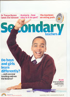
The two images above show a magazine cover which is produced for use within a school. I am looking at this cover to see whether there are any conventions which should be included within my college magazine.


The front cover of this particular issue was also on the back of the magazine therefore making it a double cover. This reflected the main article of the magazine as it was about two sides of learning, and two sides of the cover were used. One of the covers shows a boy in his school uniform with his hand up in class; the other cover shows a girl in her uniform working quietly. The two pictures reflect the two learning styles which the article within the magazine will cover.


The colour of the text used on the cover also represents the two learning styles with the text on the boys cover being mainly blue and the text on the girls cover being mainly pink. These are both stereotyped colours for boys and girls. Each cover says exactly the same thing but the way it is presented is different; one cover being presented in a more feminine way and the other in a more masculine way.

There are also sub-headlines at the top of each cover which say what else is going to be in the magazine. By showing a wider range of topics within the magazine, it will appeal to a wider audience. In this magazine the audience is teachers within a school, but it is trying to appeal to a wide range of different subject teachers by having general teaching articles rather then just focusing on one article.


Monday, 29 September 2008

Foundation Portfolio - Preliminary Task

As this is the beginning of the foundation portfolio preliminary task, we looked at how the media key concepts could be applied to producing a college magazine. We used the acronym LIIAR - Language, Institution, Ideology, Audience and Representation.

Language:
Layout, text font, colour, image, photo manipulation, sizes, proportion, angle, lighting.
Institution:
College, academic, good results, based in Hull for Hull and its surrounding areas.
Ideology:
Respect, equal treatment and opportunity, education.
Audience:
College students age 16-19, 64% female, 36% male, 55% east riding, 45% Hull, 70% go to University, 40% of those go to Hull University.
Representation:
Giving the college a positive image, promotional.