I am analysing front covers of magazines and their conventions on magazines that are targeted at the age range which is similar to the target age range for my college magazine. I am looking at these examples to see whether they have anything in common related to the target audience which I could then use within my college magazine.
 NME
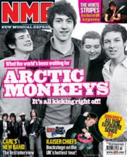
NMENME magazine is a British music magazine released weekly. It comes out every Wednesday, priced at £2.20 and available in most newsagents. It features music news, a comprehensive gig guide with reviews of gigs, singles and albums.
This image shows an example of a front cover and the layout is typical of most magazine covers. The masthead is in the top left corner so that it is more noticeable especially when it is stacked on newsagent shelves. The main article headline is shown through the centre of the page over the top of a picture. The main article and picture is of a very popular group and will therefore attract a wider audience. There is also use of contrast as the photo has been edited and is in black and white where as the text is brighter making it stand out more. Other articles which are within the magazine are then shown around the main article, in a bold yellow which once again makes it stand out. However the text is smaller resulting in the attention not being taken away from the main story.
HEAT
Heat magazine is a weekly magazine priced at around £1.65. It features celebrity news and gossip also with exclusive photos.
This image shows an example of a front cover of the magazine. Once again the masthead is on the left hand side making it more noticable. However the masthead is also very well known and can therefore a small part of it can be covered with the main articles picture and yet it is still recognised. This magazine advertises on the front that it has a 'world exclusive' which suggests that the reader will not read this anywhere else. Because of this if the audience wants to read this story they must buy this particular magazine because no other will cover it. There is also use of rhetorical questions on the cover which make the reader wat to buy and read the magazine. Smaller stories are highlighted around the main image.
LOOK
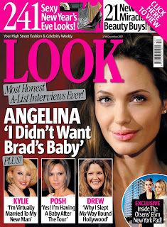
Launched in February 2007, Look is a high street fashion and celebrity weekly for young women. It has a mix of up-to the-minute affordable fashion, high street shopping advice, celebrity style and news, as well as real life stories. Look is the accessible, must-have glossy weekly high street fashion bible. Published weekly, it’s available for the bargain price of £1.40.
This magazine shows what is inside the magazine along the top and bottom of the cover. It uses numbers in big bold font to show that you will get '241' things inside the magazine making it seem more value for money. Also, a reader is almost guaranteed to like one of the '241' items. The masthead 'Look' is once again on the left and side in the upper third of the magazine. The strap line includes words such as A-List which shows it is about someone well-known and famous. Also the use of comparitive words such as 'most' makes this magazine seem better and more than any other magazine.
No comments:
Post a Comment